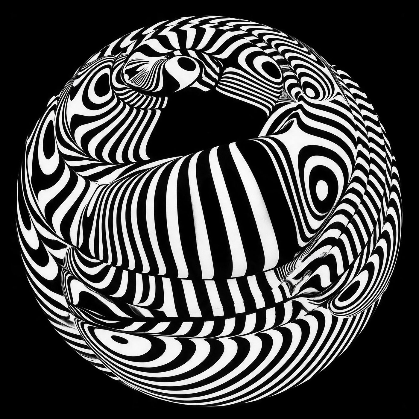
Graphics That Vibrate
Franco Grignani, an architect by training who turned to graphic design, was already doing in the 1950s what would only be given a name in the mid-1960s: Op Art. By the time the word arrived, he had years of twists, weaves and pulsing surfaces behind him, more than fourteen thousand experiments in one lifetime. He worked with a camera, glass, brushes and imperfect lenses, and created still images that the eye perceives as moving.
In 1964 the Woolmark was born, officially signed by Francesco Saroglia; for decades the design has been credited to Grignani, and the story has never been fully cleared up. It is said that the idea came to him over lunch, as he traced a rotation of arches on the white tablecloth with the tines of his fork. That skein of ribbons is still on the labels.
Movement does not need to move, the eye only has to believe it. His unstable geometries went straight to the nervous system, ahead of thought, and he spoke openly about the psychology of vision.
Now that computers can actually move anything, his lesson has become a measure of quality. Perceived movement is stronger than real movement, an image that vibrates holds the eye longer than an animation that fidgets, and half of contemporary motion design is noise precisely because it moves everything instead of making something vibrate. The vibration is built inside the image, before the animation arrives.
Here too, Grignani got there first. He did motion design without software, and without a single extra frame. I wanted to write about him because that style, brilliant and alive, is something I hardly see anymore.